
Today’s post features the first issue of Metal Men produced by the creative team of writer Martin Pasko and artist Walt Simonson without any input from the title’s prior writer/editor, Gerry Conway. Alas, it’s also the last such issue, since Simonson would only be contributing cover art going forward.
We’ll have more to say about the series’ pending changing of the guard towards the end of the post; for now, however, let’s focus on the comic at hand, starting with its cover — a typically dynamic and high-impact effort from Simonson, though the blurb above the title logo might have given some regular readers pause. “You are cordially invited to witness the destruction of the… Metal Men”? So what else is new? The Metal Men get destroyed every issue… or at least that’s how it seems sometimes.
Setting aside that exceedingly minor quibble, let’s move on to the opening splash page, where we find our storytellers picking up the threads of their two-parter right where issue #48 left off:


Dr. Will Magnus’s mental health issues go all the back to the last couple of issues of the title’s original 1960s run, which had seen him kidnapped and brainwashed by the hostile (and fictional) nation of Karnia. Though more or less “cured” by the end of the first issue of the present revival, the maker of the Metal Men is still clearly facing challenges, as shown here via his making confused callbacks to Chemo (an old foe whom the robot team most recently fought in issue #46) and the Plutonium Man (their adversary in both #45 and #47) before landing on the villain of the moment — i.e., Eclipso.

The three human females presently in jeopardy are Doc Magnus’ therapist, Isobel Sullivan; Isobel’s roommate, Johanna Rome; and Mona Bennet, the fiancée of Eclipso’s alter ego, Dr. Bruce Gordon. Perhaps it’s simply Eclipso’s hatred for his non-villainous other self that’s driving his pursuit of all three women… or perhaps, as Platinum’s dialogue appears to portend, there’s a bit more to it than that.


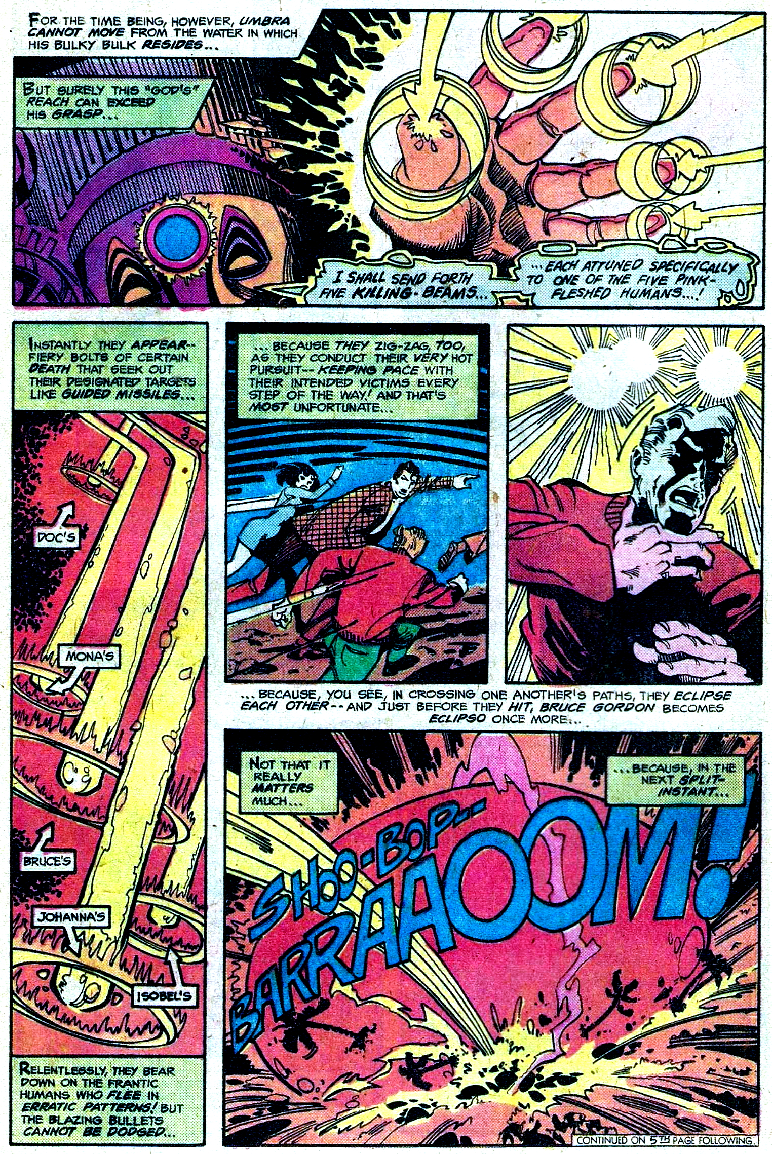
In previous posts, we’ve noted how Walt Simonson’s interest in using typography as a design element often finds expression in his art. Ben Oda may be the letterer of record for this issue, but it seems likely that Simonson offered some guidance in regards to how sound effects (as well as other specially-highlighted words) should look on the page.
UPDATE, 9/20/26: Mr. Simonson responded to this post on Facebook late yesterday, and graciously offered the following clarification re: the lettering:
I did all the display lettering — titles, sound effects, what have you, as well as panel borders and balloon borders in my early days before pairing with John Workman. John could do all the stuff I wanted better than I could do it.


Ah, OK. The women are supposed to be sacrifices. Got it now.

“… beats sucking doughnuts and whistling”? Kudos to Martin Pasko for having coined such a memorable phrase (I’m assuming it’s original with Pasko, since if it’s ever appeared anywhere else, Google doesn’t know about it).

Umbra’s origin story, with its “strange and horrible creatures from out of the depths of space” seems to nod both to the “Cthulhu Mythos” stories of early-20th century pulp writer H.P. Lovecraft and to the “ancient astronauts” hypothesis popularized by Erich von Däniken’s 1968 book Chariots of the Gods? — the latter of which was of course also serving as a primary inspiration for Jack Kirby’s Eternals series at Marvel Comics, around this same time.
Continuing with his very helpful exposition, Bruce Gordon explains how he, in becoming Eclipso, had inadvertently also become the new servant of Umbra; he goes on to speculate how, not having been raised in the local religion, Eclipso needed the parchment he stole in West Germany to tell him how to release the evil space-god. At that very moment, Gold discovers a copy of that same parchment; luckily, this one’s text isn’t in the glyphic language of the original, but has been translated into Spanish, which Doc Magnus may be able to read… though, given his currently addled state, it’s kind of a dicey proposition…


Another hallmark of Walt Simonson’s graphic approach over the decades has been his readiness to draw upon the artistic styles of historical cultures. A year before this, we’d seen him utilize ancient Egyptian motifs to build out the visual milieu of Doctor Fate; here, in the design of Umbra and his “brethren”, we see the influence of pre-Columbian indigenous American art. (The best-known example of this predilection of the artist would of course follow some seven years after this, when he’d add authentic Norse design elements to the Asgardian realms that Jack Kirby had imagined for Marvel Comics’ Thor.)

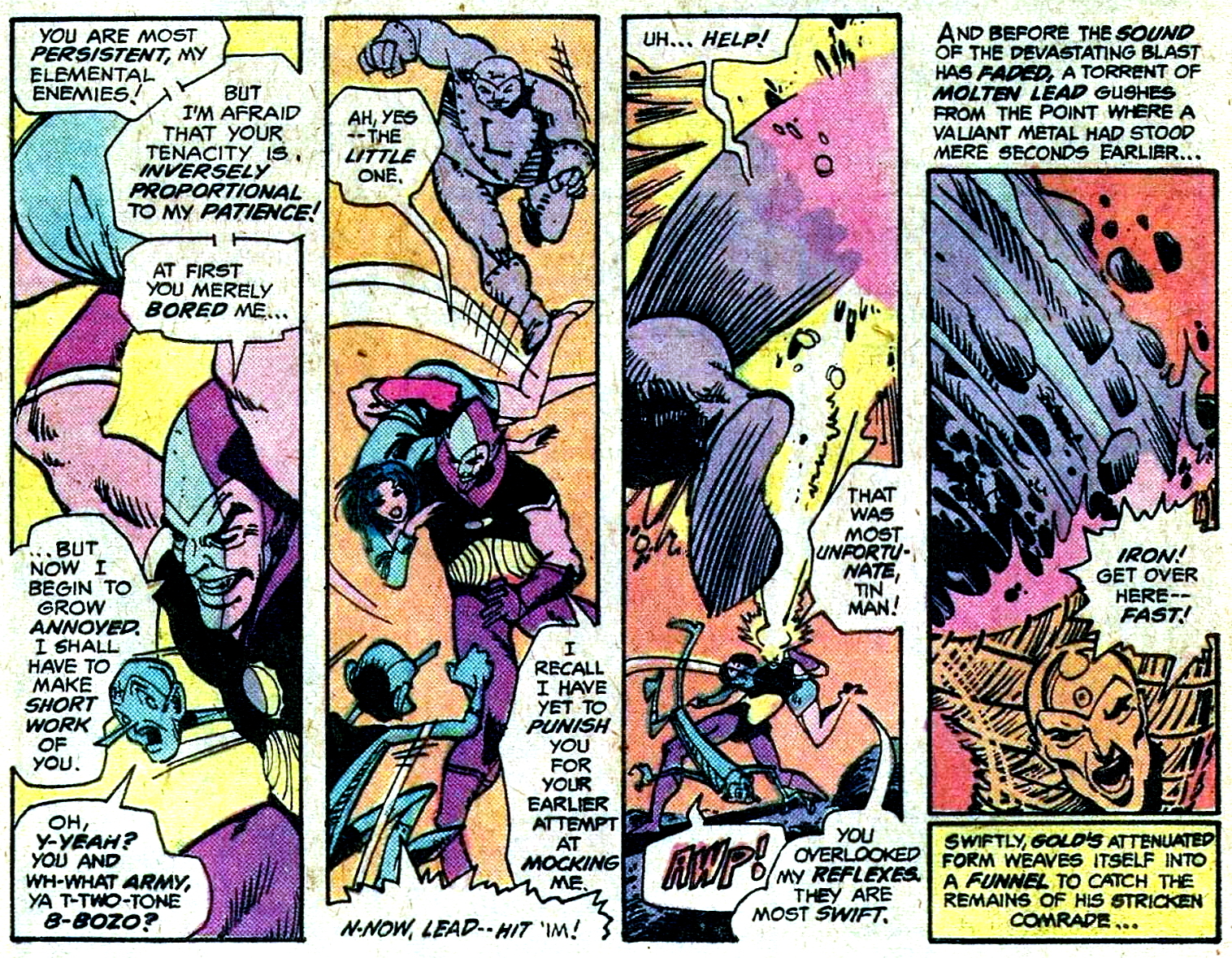
The Metal Men quickly form themselves into a slingshot, the better to lob a huge boulder right at Umbra’s kisser — but it proves to be a futile gesture, alas…


I’m not sure whether to credit Pasko or Simonson (or both), but the use of sound effects on this page exemplifies our storytellers’ determination not to take themselves too seriously. (And I’m not just talking about the Rice Krispies reference; I mean, who has ever heard something actually go “sluice”?)

Even as Iron hurries to complete his task, Umbra’s jewel is recharging itself. Finally, the Metal Men’s resident strongman’s work is done, and the “submarine” is free to flee the deep…

This is the first full-page splash we’ve had since the story’s opening page, and it’s a stunner; comprised mostly of wholly imaginary elements, it’s almost too much to take in all at once.

And that’s that. As we noted earlier in the post, this was Walt Simonson’s swan song as the story artist for this series; according to the account given by the artist himself for Modern Masters Volume Eight: Walter Simonson (TwoMorrows, 2006), he was simply “burned out” on the assignment:
I’d done five issues in about a year — it was a bi-monthly book. I had three different writers. We were getting very wonky with it with the typography and little subtitles and all sorts of weird stuff, which was fun but exhausting. But I had a good time.
Fifty years later, one may regret that we couldn’t have more of Walt Simonson’s Metal Men, while still being grateful for what we got. And you can hardly say that he and Martin Pasko didn’t end their collaboration on a high note with “The Dark God Cometh!”, which remains a highly entertaining comics reading experience.
 Interestingly, despite what the “Next” blurb at the bottom of this issue’s last page says, the 50th issue of Metal Men would not, in fact, chronicle a tale of Doc Magnus’ heroic band being “up for grabs”. Rather, the bulk of the issue would be given over to a highly edited reprint of “The Day Doc Turned Robot!”, as originally presented by Robert Kanigher, Ross Andru, and Mike Esposito in Metal Men #6 (Feb.-Mar., 1964). As a note on the issue’s letters page apologetically explained, “our overworked writer, Marty Pasko” had fallen prey to “the Dreaded Deadline Doom” (a statement that offers proof, if any be needed, that though someone at Marvel Comics may have coined the term, the House of Ideas wasn’t the only comics publisher where the “DDD” was a problem in the 1970s).
Not that the issue was all reprint. Along with another excellent cover by Simonson, Metal Men #50 also featured a 3 1/2-page framing sequence by Pasko and the series’ new regular illustrator, Joe Staton — an artist with a very different style from his predecessor, to be sure, but one that fit the title’s unique sensibility equally well in its own way. But that’s a discussion worthy of its own post — one that I hope you’ll join me for, just a few months from now.
Lots of kinetic energy in those page designs! The display lettering (sound effects) are signature Walt, as evidenced in his prior Manhunter work and in his one-off for Thrilling Adventure Stories no. 2. Even if another letterer handled them here, I’m sure Walt sketched them in place to show his intent. As shown in Chaykin’s Nick Fury story and especially in his American Flagg seven years later, he latched onto this same sensibility with the display lettering.
I shared the blog post on Facebook and heard back from Mr. Simonson himself late yesterday about the lettering. The post has been updated with the new information.
I’m not sure Von Daniken deserves credit for this one. The idea of cosmic aliens worshipped as gods goes back to the pulp days and to me this feels more in that strain than Chariots of the Gods-influenced (this is not a hill I would die on). Regardless, this was a blast of an issue.
It’s been suggested that Von Daniken borrowed, or maybe that ought to be outright stole, a lot of his ideas from the 1960 book The Morning of the Magicians by Louis Pauwels, which in turn was influenced by Lovecraft’s stories. But, hey, what’s wrong with a little plagiarism to go with a healthy heaping of crackpot pseudo-science? 🙂
Damn, Ben. I feel like I should take notes when I read your responses. My compliments on your background knowledge and skills.
1976 and 1977 were bereft of my usual DC purchases due to moving to Lincoln and Mansfield which didnt have any shops selling comics much that I found to my dismay, so most of it is blank to me, though the down-grade in printing quality and page reduction makes me less sad these days! I like the art work in this one, a shame Simonson couldnt continue, and Metal Men had been one of my enjoyed features when I was younger. This issue would look great if given the digital restoration treatment! One can always hope!
I take it that was before Worlds of Wonder opened in Lincoln? I used to frequent that shop in the 80s. Just a short train ride from Cleethorpes, where I lived at that time.
sadly yes, I went to Uni at Lincoln but left in 1980, it wasn;t long before I found an actual comic shop in Nottingham though, that was my first regular proper comic shop!
Closest (not very) I ever came to Cleethorpes was Grantham railway station, en route from London King’s Cross to visit friends in Edinburgh.
You came so close to the heady pleasures and wild revelry of Cleethorpes…
🤣
Just based on this issue, this is an example of Simonson released, drawing in a dynamic style unlike that of anyone else at the time in mainstream U.S. comics. I was rather confused at to how Doc Magnus was able to manhandle Eclipso and threaten to tear him apart. Given what’s been shown of Eclipso’s powers and that Doc Magnus is no more powerful than, say, Tony Stark without his armor, how could Doc, armed solely with his human body, have any capacity to pose a genuine threat to Eclipso?? Am I missing something there? Still, overall, a fine work of heavy metallic fantasy!
I was likewise confused by this. I guess he was weakened by Umbra’s blast from the previous page?…. but it’s not made explicit… and Doc looks like he’s exhibiting better than normal human strength tossing him with one arm. He somehow also steals his diamond too without a free hand apparently?
Like the previous issue of Metal Men, I have never read this one. I have to say, the story by Martin Pasko & Walter Simonson is a lot of fun, and the artwork by Simonson is absolutely stunning. Simonson was only 30 years old when this issue came out, and he’d only been working professionally for about five years, and already his work was majorly impressive. It’s not at all surprising that over the next half century that Simonson would go on to have such an acclaimed career in comic books.
I recently re-read Simonson’s underrated 25 issue Orion series that came out in the early 2000s. I think I noticed for the first time just how much his artwork worked in tandem with the lettering & sound effects, which there was by John Workman, who had also done many of other Simonson books. I can only conclude that Simonson and Workman must have worked closely together, and I feel it’s safe to say that the same thing probably occurred earlier here with Simonson and Ben Oda.
Whatever the case, I feel that lettering is a very underrated art. It’s essential to the comic book form, but I think most people do not realize just how important it is until you get a story which contains a bad lettering job. Oda was definitely one of those old-time letterers who did a really solid job on the books that he worked on.
Thanks for another informative retrospective, Alan.
Orion is the only A-list New Gods series that wasn’t Kirby, IMHO.
It’s been a while since I read Orion, but my main takeaway with the art is how Simonson threaded that difficult needle of maintaining a Jack Kirby influence while still making the book his own.
Workman is also a good artist and a nice guy. Haven’t spoken to him in years, but he was always pleasant.
Todd Klein celebrates a lot of top letterers on his blog, without tooting his own horn. Gaspar Saladino is probably at the top of my list, but Ben Oda is very close.
Gaspar Saladino – or L. P. Gregory as he was known while working for Marvel. A terrific letterer by any name.
Metal Men is just way more fun than Thor. Wish Simonson had done an extended run on this book.
I didn’t get what Simonson was up to at the time, so enraptured by his still incredible Manhunter work. (And still a way-too-over-serious adolescent!).
I get it now!
Manhunter had Archie Goodwin scripting. Now he and Walt were a formidable team on that feature.
I loved this when it was published and would have even if Simonson had been workin with a lesser script. Pasko was never a favorite but he was almost consistently good. I was sad to see Simonson go. I love Staton as well but he still felt like a disappointment when he took over.
If I hurry, I should be able to jump on the bandwagon praising Walt Simonson’s bold and dynamic art. While this was a fun story, truth be told, it’s nothing remarkable. Indeed, Pasko’s “cutsie captions” – way too prevalent in the 70’s – were just this close to being an unwelcome distraction for me. But with art that’s ready to pounce from the page, I could overlook such sins.
Put it another way. Substitute the Mighty Walt for (an artist you don’t like) and would our collective responses be anywhere near as favorable? This issue proves how quality artwork can elevate even the most mundane of stories.
And I can’t hit “send” without sharing the rather embarrassing fact that when I first saw Simonson’s Thor #337, I did not like his art. I found it way over the top with those huge letters and giant word balloons. I was also ignorant of his DC work – having either not collected comics and/or devoting my attention to the Marvel side of the fence. However, two issues later, I found myself completely mesmerized by his stellar art and story on the Thunder God.
Of course, I never have such hesitations with Alan’s wonderful reviews. Likewise, I thoroughly enjoy the commentary all of you provide.
Simonson is a perfect example of an artist who took a style that was deeply inspired by Kirby and then turned it into something wholly his own. Of course, the production of superstar artwork both takes time and a toll on the artist, which explains why, with a couple of notable exceptions, that Walt jumped from assignment to assignment in order to keep himself inspired and interested. As for Pasko, I tend to lump him in with Elliot S. Maggin and Cary Bates; not really A-list talent, but a solid journeyman who knows what it takes to write a solid story. This is one of his better ones, so I’d guess he was inspired by the Metal Men as well.
There are a number of things about the Metal Men that always bothered me, starting with their lack of individual agency and the fact that they seemed unable to function outside of the team, but you can kind of chalk that up to when these stories were being written. I can’t remember seeing a Metal Men story lately, but hopefully someone has gotten their hands on them recently and opened up the possibilities such a group would suggest. Thanks, Alan!
Kirby and a lot of Toth, coupled with Walt’s own design sensibilities.
I picked this one up back in the day for the art alone. I was neither a DC fan at this time and was lukewarm at best on the Metal men.
Simonson was a distinctive and dynamic artist/storyteller from the get go. Lots of great stuff here but also a minor quibble that I have with his work in regards to pacing…. everything seems to move at 100mph from panel to panel. To his credit he avoids anything coming across as static or dull, but by not including any quiet moments the action never gets a chance to build since it’s seemingly constant.
His use of sound effects is some groundbreaking stuff. It’s an arguably corny device in comic books that had been routinely mocked by the time SImonson came on the scene, but not only does he embrace it… he makes it distinctive and cool. A stellar eye for design.
A keen observation about the pacing with Simonson’s work. Back when he and his wife were doing the honors on X-Factor, I used to wonder when those poor characters ever got to even use the bathroom.
To my recall, there were more quiet moments during his run on Thor, and he significantly built up the characterizations of Balder and Vollstagg to a greater degree than anyone else had done in over a decade. So at least by that time, Simonson was slowing down the pace much more than was evident in this story.
Yep… I think during his Thor run he started opening up his panels with more negative space than he’s using here… and that open space gave the characters some breathing room even if the drama remained heightened. I think it’s not unlikely he simply wasn’t that interested in that aspect at this point in his career compared to overall panel and page design. He obviously cares about every panel… his dial is just set at ten on all of them even when the characters are just talking or walking up a hill. I think Gil Kane’s characters often give the same appearance of never being at rest due to his angles, cropping, and how chiseled they are.
Artists a generation or so older did stints in other genres like romance which probably helped in developing those particular muscles.
Made me think of Kirby’s run on Thor during the Hercules/Pluto saga and during which his alter ego, Donald Blake, doesn’t appear at all for multiple issues, a definite change in the usual formula. However, in the segment after Thor has been seriously hurt during his battle with the would-be usurper Siedring, Thor is shown in bedrest, taking at least several days to recover his health and strength. Meanwhile, Hercules is tricked into signing a contract to take Pluto’s place in ruling Hades. Kirby was starting a run wherein it seemed Thor often had little time to catch his breath, never mind transform himself into Dr. Blake and see to any patients. But, yeah, every so often, Thor did get a bit of a breather between brawls, even if at least twice due to being nearly beaten to death while deprived of much of his power by his not quite so wise big daddy.
I frankly think he just went *wild* with this story —- super adrenaline rush.
BOY, those “Anniversary Issues” have got some bad timings sometimes! First, Avengers 150, then Metal Men #50! Who’s next?
I’ve forgot, the next issue would be seeing what would becoming THE Classic DC logo that we would be loved to this day, thanks to James Gunn’s blockbusters (and some busts, as well)!
I liked this one myself. It’s predecessor in the 20 cents days, on the other hand, was rather stark and minimal.
15-year old me would have not liked this at all if he’d seen it. 15-year old me was all about the serious issue of comics evolving into a new and sophisticated ‘adult’ literature and moving away from the stigma of being juvenile, kiddie, disposable trash (if you get the impression that 15-year old me was insufferably arrogant and opinionated you might not be far wrong). Cute captions and funny sound effects were not the way forward for the medium or elevating the material in the way that I would have wanted – If the creators aren’t taking this stuff seriously, how is the audience supposed to? The most annoying sound-effect was (I think) the ‘shoo-bop-barraaoom!’ of Umbra’s bolt that was meant to destroy the humans, but ‘snap, crackle and pop!’ and ‘scoop!’ (when the Metal Men scoop up Eclipso) are both contenders.
65-year old me hasn’t entirely moved away from this opinion (but I hope I’m nowhere near as arrogant, thanks). I’m much better at being open-minded enough to appreciate Walt Simonson’s exceptional talent and design chops, although I still prefer his more realistic debut on Manhunter to the more exaggerated, cartoony style that he evolved into. To me, the jokey, not-too-serious presentation of the story removes me from feeling any involvement. It is as though the creators are saying that you don’t need to take the story seriously, therefore any real sense of connection is removed.
If I was more invested in the story, I might note that Doc Magnus’s mental health issues don’t seem to be portrayed consistently with previous issues, and there might be more of a concern today about the way they are presented at all.
Anyway, thanks, Alan!
Reading of your attitudes towards comics back in the day makes me reflect not so much on my own attitude at the time, but the views of the outside world on such matters (does anyone still call them “mundanes”?). Nearly fifty years ago, about to graduate from high school, I applied to the main art school here, and fronted up for an interview bearing samples of my artwork. I could tell from the crestfallen faces of the pair interviewing me that including comics-related drawings was not a good idea, let alone mentioning an interest in ’em (toned it down some from major obsession)…needless to say, I didn’t get in.
Roll on a few years, and, having done a more commercially-oriented course elsewhere (where my love of comics was treated as an amusing aberration), I trudged around advertising agencies showing my portfolio. They were all pretty ho-hum about it, but the page of comicbook art I included was the single thing every one of them showed an interest in, and a few years later I picked up some work at one place doing comics-related material which led to ten years of freelancing for them.
In the meantime, one would occasionally see, usually on TV news as filler material, reports about conventions, which portrayed attendees as simple-minded cretins who should know better.
Many years have passed since then, and I could only wonder as I discovered last week that a university here, (which I worked in for 15 years last century) which promoted itself as an olde-worlde bastion of academic excellence and intellectual rigour, is now offering a “Bachelor of Creative Arts majoring in Comicbook Creation”….how times change!
I’m a native of Dover, NJ, and I want to point with pride that Joe Kubert set up his school there!
I remember fun evenings reading and re reading this! The art was very Kirby-esque! The story was cool! Thanks!
As usual, a great write-up, Alan.
Re-visiting this fun issue and the ones preceding it, as well as that tremendous Dr. Fate story from 1ST ISSUE SPECIAL, it saddens me that Pasko and Simonson didn’t get to do more together. I’m not saying they would have the next O’Neil-Adams or even the next Englehart-Rogers, but they seemed to have been plugged into a pretty similar sensibility. Pasko would go on to write a few terrific Superman stories, and Simonson – well, we all know about him. But I would have liked to have seen them do some more together. (As I recall, Pasko did a few Plastic Man stories with Joe Staton for ADVENTURE COMICS. I bet Simonson would have had some fun with one of those.)
Always loved the use of “sluice” as a verb.
Who says comics can’t be fun?
Of course, being a true Marvelite at the time, I completely missed this….but it is a real tour de force from Simonson and Pasko; Simonson’s art is so idiosyncratic that any other finisher would not have done him justice. The spash page in the middle of the story is tremendous; it looks as if Simonson had seen some of Kirby’s splashes and double pages in the Eternals and wanted to do something similar ( but, of course without mirroring the art…but providing the impact and awe).
Very odd how the Doc took it upon himself to duff up Eclipso. This is a month of some odd characterisations and reactions in the comics that you have chosen to review Alan, taking into account both this and Prof X’s truely over the top reaction to Scott wanting to stay with Jean in X-Men #102 ( ‘ You ungrateful, unspeakable…CUR!). Hope you never got any similar sort of treatment when at senior school Alan!
An excellent conclusion to the story. The writing is some of the best I’ve read in the title and the artwork is superb. Some have commented about the humor in the story, but the Metal Men have almost always been humorous. And that’s what I like about the title.
As for Orion, I just recently subscribed to DC Universe Infinite, and when I saw that Simonson was writer/artist for it I added it my must read list. I hope to get to it before the end of the year.