
You’d likely never guess it from the wholly acceptable, but not especially memorable Earl Norem cover to the comic book that’s our topic for today — but, half a century ago, Savage Sword of Conan #14 represented something of the end of an era… even if no one knew it at the time. That’s because its pages contained the very last collaboration between writer Roy Thomas and artist Neal Adams — two creators whose previous joint efforts, though relatively few in number, comprised some of the high water marks of the late Silver and early Bronze Ages of comics.

Cover to Conan the Barbarian #37 (Aor., 1974). Art by Neal Adams.
As most of those reading this will already be aware, the duo’s previous achievements had included a brief but brilliant run on X-Men, as well as a shorter but just as classic stint on Avengers. Other collaborations included three episodes of the “Inhumans” feature in Amazing Adventures, as well as contributions made by both men to the initial installment of another AA series, “War of the Worlds”. And then there was the last comic the two had worked together on prior to the one we’re discussing today: Conan the Barbarian #37, which had reached newsstands in January, 1974.
Virtually all of the Thomas-Adams projects, however successful they were artistically, seemed to run into behind-the-scenes problems of one sort or another. Often, there were deadline pressures involved, though this wasn’t always the case; with Conan #37, the main issue had to do with the story, which Adams had begun working on expecting it to run over 30 pages and ultimately appear in Savage Sword of Conan, only to have it converted midstream into a 19-pager for the color Conan comic. While Adams was hardly happy with the outcome (which required him to draw several pages with a large number of tiny panels, just to get the whole story in), he seems to have taken it pretty much in stride; and not long thereafter, he and Thomas (who, incidentally, seems to have been the only writer at Marvel Comics during this era with whom Adams was interested in working) agreed that they’d do another Conan story together: an adaptation of Robert E. Howard’s 1935 prose tale “Shadows in Zamboula” (original text available here), which was (again) intended to appear in the black-and-white, “mature readers” Savage Sword.
Over two decades later, in an interview with Arlen Schumer for Comic Book Artist #3 (Winter, 1999), Adams recalled the conditions he had stipulated before taking on the assignment:
After I had done the first Conan story, I told Roy I need to be able to have the time to do this. We agreed it wasn’t going to be put on the schedule until I finished the whole job (for the first time in my career). I laid out a book completely, so that I would be satisfied with the whole project. These layouts were done so tight that you could almost ink them.
“Shadows of Zamboula” finally appeared in print in July, 1976, a full two and a half years after the publication of Conan the Barbarian #37. Arriving at a time when comic-book artwork by Neal Adams had become a scarce commodity, it’s fair to say that it was highly anticipated by its fans — more so because Thomas had been talking it up in the Savage Sword letters pages and “coming soon” house ads for some time. But, surprisingly, the lead story that greeted purchasers of SSoC #14 once they’d flipped past the cover and introductory pages wasn’t a pure Thomas-Adams collaboration; rather, the opening page credits attributed the artwork to “Neal Adams and the Tribe” — the latter appellation referring to the group of Filipino artists who worked in the studio of Tony DeZuñiga.
Unsurprisingly, Neal Adams wasn’t happy about this development. As he told Arlen Schumer in 1999:
How this unscheduled book got put on the schedule, and what happened subsequently to that book, is something that I don’t really know or understand and consider a real tragedy in my professional life. Roy suddenly sent copies of my layouts to the Philippines, where they were finished up by Filipino artists who obviously didn’t understand them…
Also unsurprisingly — but in line with his and Adams’ individual accounts of several of their other collaborations — Roy Thomas would recall the circumstances of this situation rather differently. Writing in response to Adams’ Comic Book Artist interview in his own fanzine, Alter Ego (this piece, which originally appeared in Alter Ego v.2, #5 [Summer, 1999] was later reprinted in Alter Ego: The Comic Book Artist Collection), the author began by acknowledging that “Neal and I disagree on key points, and there is no way to reconcile those differences — only to record them”, before going on to say:
I can basically accept Neal’s statement in CBA #3 that, at the start, he and I had an agreement that… we wouldn’t schedule this new adaptation till he was finished with it. I don’t recall making such an agreement, but I’ll assume I accepted those terms or something very much like them…
However, even accepting for the sake of argument (or to avoid same) that we started out with a “no-deadline” agreement sometime in 1975, I’m fairly confident that, by some point late that year (perhaps pressed by me, perhaps on his own volition), Neal committed to delivering the finished job at some particular date I felt I could count on, thus superceding [sic] any previous agreement.
I can’t prove this any more than Neal can prove his recollections — and I’m dead certain both of us are being totally honest here — but without some sort of verbal commitment on Neal’s part, given our prior history, I would never have run a full-page house ad in Savage Sword #11 stating that #12 would feature the Adams-drawn “Shadows in Zamboula.” [See at left.] Certainly I wasn’t looking for any kind of showdown.
Cover to Savage Sword of Conan #12 (Jun., 1976). Art by Boris Vallejo.
When #12 came out two months later, however, it featured a story drawn by John Buscema, not Neal — and my perhaps-too-facile explanation that in the interim I had discovered another “already-penciled episode in Conan’s life which by rights ought to be published first.” This reads to me now as if I were trying to cover for the fact that “Zamboula” was coming in slowly, if at all.


While Thomas doesn’t get into this aspect of things in his account, your humble blogger thinks it’s worth noting that the writer/editor had a loose continuity of sorts going in Savage Sword of Conan during this time. While it was hardly as rigid as the “aging in real time” conceit that informed Thomas’ approach to the monthly Conan the Barbarian title, the fact remains that, with its second issue, Savage Sword had begun a program of adapting a certain range of Robert E. Howard’s Conan stories in chronological order; not the order that REH had written them in, you understand, but the order in which fans P. Schuyler Miller and John D. Clark, and later the fantasy author L. Sprague de Camp, had arranged them to create “A Probable Outline of Conan’s Career” (as Miller and Clark’s original 1938 essay was called).
Following the appearance of “Black Colossus” in SSoC #2 (Oct., 1974), Thomas, working with artist John Buscema and other artists, had gone on to adapt “Iron Shadows in the Moon” in issue #4 and “A Witch Shall Be Born” in #5. Between these adaptations, and from issue #5 onwards, the book had largely featured original Conan stories intended to fill in the gaps between the Howard yarns, albeit with some significant exceptions (e.g., the concluding chapters of Marvel’s multi-part adaptation of the pulp author’s single Conan novel, “The Hour of the Dragon”, following the cancellation of its original home, the quarterly color title Giant-Size Conan). Still, as far as the chronological sequence of Howard stories that had kicked off with “Black Colossus” was concerned, the next story after issue #5’s “A Witch Shall Be Born” should be “Shadows in Zamboula”. All things considered, I don’t think it’s too hard to see how, by the time #11 rolled around, Thomas would have been more than eager to get his and Adams’ version on the publishing schedule.
Of course, that begs the question — if Thomas was so keen to have “Shadows” appear in sequence, and thus within a certain period of time (however elastic that period might need to be), why tell Adams that he basically had as long as he wanted — the rest of his working life, even — to get the job done? Assuming that the two men agreed to work on the story together not long after they wrapped up Conan #37 — which would have been around the time Savage Sword of Conan made its debut on the nation’s magazine racks — Thomas might have figured that, given that he planned to adapt three Howard Conan tales before “Shadows”, and that he didn’t need to have a Howard adaptation in every issue, and that SSoC was only published bimonthly, he wouldn’t need to worry about the story he’d assigned to Adams for a year or more. Surely that would be enough time for the artist, even busy as he now was with his commercial art career, to knock out one 39-page comic-book story in pencil and ink.
Still, even if such an assumption was logical from Thomas’ viewpoint, it doesn’t tell us whether the writer/editor ever shared any of those considerations with Adams — whose 1999 recollections didn’t include Thomas’ having given him a deadline, ever. And while Thomas said he didn’t believe he would have run a “next issue” promo for “Shadows in Zamboula” in SSoC #11 if he hadn’t gotten some sort of “verbal commitment” from the artist that the job would be finished in time, he stopped short of claiming to actually remember Adams making such a promise… so, who knows.


From Savage Sword of Conan #12. Text by Roy Thomas; art by John Buscema and Alfredo Alcala.
In any event, it’s interesting to consider Thomas’ later speculation that he might have been bending the truth just a little in his issue #12 letters column “Apologia” (see left) when he claimed to have “discovered” that the issue’s lead story, “The Haunters of Castle Crimson”, needed to be published ahead of “Shadows” to preserve the chronological sequence… because, at least as published, it definitely does precede the latter story, to the extent that its very last page (see right) actually tells us that the city of Zamboula is the barbarian adventurer’s next stop. Though I suppose it’s possible that, as Thomas’ lettercol notes, the story had at that point been pencilled but not scripted, allowing him to make last minute adjustments so that a tale that was originally meant to follow “Shadows”  would come ahead of it, instead. Either way, between the next-issue ad (see left), letters column notes, and the in-story information, Thomas had pretty well boxed himself in, in that he needed to run “Shadows in Zamboula” in Savage Sword of Conan #13, or own up to things having gone greatly awry.
We return now to Thomas’ Alter Ego: account, picking up where he’d left off — i.e., right after he’d sent issue #12 to press, back in the spring of ’76:
At any rate, it was two months more till #13 was due, so surely the story would be ready by then. I dared hope that, if Neal was unable to finish the entire story on his own, he would assemble a contingent of Crusty Bunkers (the name for the loose amalgamation of young artists who worked for and with Neal on inking jobs during the 1970s) just to get the job done.
However, I clearly hadn’t covered myself by getting quite enough Conan stories in the works to allow for non-delivery of “Shadows” for a second issue in a row. That was definitely a mistake of mine. But, that said: when I scripted the 39 pages of Neal’s story, that took away from the time I could devote to scripting another one…
Thus when, after stalling for the full four months between #11 and #13, either “Shadows in Zamboula” had to be in Savage Sword #13 or the Conan story in the issue would be a reprint —
— it was a reprint.
Cover to Savage Sword of Conan #13 (Jul., 1976). Art by Richard Hescox.
The only reprint lead story in the 60 issues I edited of Savage Sword, or in fact in the entire 235 issues of the magazine.

The story that was reprinted in SSoC #13 was a good one — Thomas and Gil Kane’s 1972 adaptation of the REH story “The Gods of Bal-Sagoth” — but I already had the original, full-color version in the form of Conan the Barbarian #17 and #18 tucked away in my collection, and in the end, I apparently couldn’t see dropping a $1 on a magazine that was mostly material I already owned — even at the dreaded cost of (gasp!) “breaking a run”. (I might have succumbed, had the issue featured a new chapter of the ongoing adaptation of Howard’s essay, “The Hyborian Age”, by Thomas and artist Walt Simonson; but the only actual new comics material presented in #12, a 10-page adaptation by Doug Moench and Steve Gan of Howard’s Solomon Kane story “The Right Hand of Doom”, wasn’t enough to clinch the deal on its own.) Was mine the only sale Marvel lost that month? I’d say that’s unlikely.

From Savage Sword of Conan #13. (Note that this ad’s content has been lifted directly from #12’s full-page house ad for #13, despite the fact that the Solomon Kane story promoted here appears in this same issue.) Third time’s the charm, anyone?
Again, we return to Roy Thomas:
And, to make things worse, at this point Stan [Lee], now the publisher, decided to make Savage Sword a monthly starting with #14, meaning that I had only one month, rather than two, to get something to fill it.
In the end, as the deadline for #14 loomed… I had seen only three or four completed pages out of the 39, plus a smattering of partly-inked pages. At that point, I felt I had to take the breakdown photostats, in various forms, and ship them halfway around the world to the Philippines to get them done on a rush basis! Tony DeZuniga and his Tribe, the Filipino equivalent of Neal’s Crusty Bunkers, came through like champs under difficult circumstances with finished artwork and inking, even a bit of penciling here and there where needed — and “Shadows in Zamboula” finally appeared, just barely, in Savage Sword #14.
And that’s the story behind the story. We’ll have some final reflections on this unfortunate episode to share from both Roy Thomas and Neal Adams, later in the post; but for now, what say we go ahead and take a look at the thing itself — i.e., Robert E. Howard’s “Shadows in Zamboula”, as adapted by Thomas, Adams, and the Tribe… though, before we do, I can’t resist sharing the following illustration by Frank Brunner and Steve Leialoha, which appeared on Savage Sword of Conan #14’s inside front cover…

…simply because it’s a really nice piece. And now, without further ado:


We’re going to pause here just a moment to take note of a small but, I think, significant edit made by Roy Thomas to the original text of the “desert rat”‘s dialogue in the next to last panel above. Here’s how it originally appeared in Robert E. Howard’s 1935 story (save for the italics, which have been added by your humble blogger):
“Aram Baksh is a demon! Nay, in this accursed city which Stygians built and which Hyrkanians rule — where white, brown and black folk mingle together to produce hybrids of all unholy hues and breeds — who can tell who is a man, and who a demon in disguise?…”
The phrase that Thomas has excised (wisely, in my opinion) is a blunt expression of a theme that pretty well permeates Howard’s story: a community that allows people of all races to mix and mingle, sexually as well as socially, is simply begging for all kinds of trouble. As we’ll see, this won’t be the last time Thomas makes a subtle adjustment to his source to reduce the potential of Marvel’s adaptation to offend readers on racial grounds.

Given that Conan’s just arrived in town, his knowledge of his old comrade’s horse-stealing escapades likely goes back to their prior association among the Zuagirs. In any event, our hero ultimately decides to shrug off the other man’s dire warning regarding his chosen place of lodging…

“– and I wanted to be sure I had a roof over my head tonight!” While quickly quaffing his tankard of wine , Conan observes aloud how odd it is that no one, not even beggars, uses the surrounding streets and alleyways to sleep in. He then follows his host out of the common room; behind them, one of the men sitting there — a lone Stygian scholar — suddenly and inexplicably laughs, discomfiting the others…

In remaining faithful to Robert E. Howard’s original text, Roy Thomas’s script refers to Conan’s weapon as a “naked broadsword” — despite Neal Adams and the Tribe having clearly drawn it as being still sheathed within its belted scabbard. Oh, well.


There’s not much Thomas can do to mitigate the racism inherent in this particular aspect of Howard’s story, which seems very likely to have been inspired by the once common belief that virtually the whole continent of Africa was teeming with cannibals. It should be noted, of course, that there are a few Black characters in the story (mostly unnamed slaves) who aren’t identified as cannibals; and there are non-cannibalistic Blacks who appear in other Conan stories by Howard, as well. As for Marvel’s comics, the monthly Conan the Barbarian title was at this time in the midst of a several-year storyline, based on Howard’s “Queen of the Black Coast”, which featured a number of sympathetic Black supporting characters; that in itself may have helped deter many of the original readers of this adaptation back in 1976 from perceiving this material as being racially problematic.


With the story’s first full-page splash since the title page, its lead female character makes her debut appearance, and Neal Adams and the Tribe take on the same challenge that John Buscema and Alfredo Alcala had previously, back in Savage Sword of Conan #4 — namely, how to draw a woman who appears topless throughout a lengthy comic-book narrative without ever showing her breasts fully exposed.

That bottom tier of panels on the page above, with its tilted, ground-level camera angle and superb pacing, is great graphic storytelling — and quintessential Neal Adams. Just sayin’.
We’ll also note here another example of Thomas’ editing to reduce the racial charge of his source text; in Howard’s original, that last line of Conan reads, “Black dog of Hell!” (emphasis added).

The young woman explains that her lover, a young Turanian soldier, lost his senses after being drugged by another man who desires her: Totrasmek, the high priest of the god Hanuman. Her account is interrupted when both she and Conan hear the sound of nearby voices; slipping into an ally, they listen intently as a group of cannibals stride past, discussing how they’ve had slim pickings so far this night, but trust that Aram Baksh will have come through for them as usual. “Many a man we have taken from his tavern,” observes one. “But we pay him well in stolen goods for them!”


The page shown just above may be the least “Neal Adams-y” page we’ve seen yet, as far as the look of the finished art is concerned. That said, Adams’ hand is still very much in evidence, both in the layouts and in the fundamental figure drawing underlying the Tribe’s embellishments.


Acceding to Zabibi’s request, Conan heaves the unconscious and bound Alafdhal over his shoulder, then follows her to her house. The door is opened by a mute Black slave the woman is careful to identify to Conan as “not from Darfar” — i.e., not a cannibal. (Thomas is following Howard’s lead, here, though in the original text Conan is able to make this distinction on his own by taking note of the slave’s close-cropped hair and unfiled teeth.) Once the unfortunate soldier is safely deposited, Conan and Zabibi return to the streets to make their way to the shrine of Hanuman…


Conan follows Zabibi up the steps and into the shrine — though he takes care to avoid a faint groove running from the top of the steps to the altar, certain that it was worn “by the faltering feet of the multitude of those who died screaming on the grim altar.”


As rendered by Adams and the Tribe, Baal-pteor seems obviously meant to be taken as Black; however, in Howard’s original text, the character is described as “brown-skinned”. (I mention this only because Howard himself seems to have put significant store by the difference between “black” and “brown” on a pretty consistent basis.) As to the significance of his name — which the guy says “any temple wench” could explain to Conan, after which Conan calls him Totrasmek’s “dog” — well, that exchange of dialogue is just as opaque in Howard’s text as it is in Thomas’ script adaptation, so your guess is as good as mine.

In the next moment, the mist swirls up from the floor, enveloping Conan. He feels a sense of dislocation, and then, suddenly he finds himself standing in a marsh, facing down a charging buffalo. Conan manages to run the beast through the heart, only to have it metamorphose into Baal-pteor himself. Our hero promptly decapitates his foe; but the severed head, still very much alive, soars up off the ground and fastens its teeth in Conan’s neck. As Conan struggles, there comes once again the sudden sense of dislocation…


Adams and the Tribe have been handed another challenge here — to make a stationary strangling contest as exciting as a duel fought with fists or swords — and they meet it about as well as any artists could, in this reader’s opinion.


Here’s yet another instance where Thomas’ script has toned down the ethnocentric overtones of his source material. In Howard’s original story, right after Conan calls Baal-pteor a fool, he says, “I think you never saw a man from the West before” — which would seem to imply that, in Conan’s mind, even “civilized folk” from “the West” (the Hyborian equivalent of Europe) should have a natural edge on human beings unfortunate enough to hail from other parts of the world… if perhaps not nearly as much of one as a barbarian like himself.
But, moving on… We come now to another full-page splash — which like the last one, puts the lovely Zabibi front and center. (Not that I’m complaining, mind you.)


“Well, what matter?” Zabibi retorts. “You have the ring now!” But Totrasmek denies that the ring is in his possession, though Zabibi is insistent that it must be; after all, her lover had been wearing it when he chased her into the streets, and now he’s not. The high priest waves this aside, however, even as he proposes to be merciful. He’s willing to give Zabibi that which can restore her lover’s mind — “the juice of the golden lotus”, contained within a glass phial. All she has to do is come and take the phial from his hand…


Zabibi is gladdened by this news, but says that they should leave in a hurry, regardless — because, if the worshipers of Hanuman find them there in the morning, they’ll tear them to pieces. Conan has no reason to argue with this assessment, and so the two are soon back on the dark streets, hastening away from the shrine….


I can’t remember if my younger self was surprised by this last turn of events the first time I read “Shadows in Zamboula”, either as a prose story or in Marvel’s adaptation — but I must confess, it snuck up on me in my latest re-reading of the latter for this post. Which, honestly, it shouldn’t have, given the story’s several earlier references to Jungir Khan and Nafertari, which would otherwise be completely irrelevant to the narrative. D’oh!
Anyway, Conan appears to accept Zabibi’s — excuse me, Nafertari’s — dismissal; but, once he’s rounded a corner and is out of her sight, he hurries to the city’s horse market, where he quickly avails himself of a trader’s fastest mount. (Again, Thomas chooses here not to use one of Howard’s more objectionable bits of dialogue, when Conan rousts the reluctant trader by exclaiming, “Don’t you see I’m white, and alone?” — a line which might be explained as Conan simply pointing out that he’s clearly not one of the roving cannibals, but in the long run, isn’t really worth the potential grief.)


Standing on his horse’s back, Conan quickly scales the wall. He finds one guard on the other side — it’s the Stygian scholar who’d laughed in the inn’s common room earlier, and who now stands revealed as the innkeeper’s accomplice in perfidy — and after swiftly and silently snapping the man’s neck, proceeds to Aram Baksh’s door…


The brutality of this last sequence — which, as will likely surprise no one, is straight from Howard — is an excellent example of why Marvel needed a non-Comics Code-approved vehicle for adapting certain Conan stories… at least, if they wanted to be at all faithful to them.

And with that last, ironic twist, we’re done.
Before I offer my own summing-up thoughts regarding this piece, here are those last few words from Neal Adams and Roy Thomas’ respective reminiscences of 1999 that I promised you earlier. We begin with Adams:
There are a certain number of pages here that I carried through exactly the way I wanted to see them done. In the panels that I inked, you can clearly see the sincerity of what I was doing. To have this thing treated this way was just so very, very disheartening. To have layouts taken away and done by other people is not something that should be done to anybody, for any reason. I really wanted to finish this story; I felt this would be my definitive Conan story…
And now, here’s Thomas:
Naturally, it didn’t look quite as good as if Neal had done the whole job himself, since Tony and the guys had had to guess at what Neal intended in certain minor details… but comics, like politics, is the art of the possible.
This was a relatively ignominious end to my collaborations with Neal, but, love his work though I did (and do), I felt I’d had little choice but to do what I had done. I wished then, and I wish now, that it could have been otherwise…
For my own part, while I’m sure my nineteen-year-old self would have preferred an all-Adams art job on “Shadows in Zamboula”, I don’t recall being especially disappointed by the work done by Tony DeZuñiga and his Tribe. And I still feel pretty much the same way today; what few problems I do have with the published artwork have more to do with the inconsistency of its look from one page to another, rather than any wide variations in actual quality. To be entirely honest, I don’t really know what to make of the assertion by Adams I quoted earlier, that the Filipino artists “obviously didn’t understand” his layouts; to my eye, Adams’ design sense, approach to body language, and overall visual storytelling style are evident on every page. Still, I’m not an artist, and I suppose others may see things differently. In any event, I’m sorry that the ultimate result was as distressing to Adams as it was, even if I have a higher opinion of the finished product than he did.

Cover to The Six Million Dollar Man #2 (Sep., 1976). Art by Neal Adams.
And while it’s certainly regrettable that the fruitful (if often fractious) creative relationship between Adams and Roy Thomas ended as sourly as it did, I think it’s also worth pointing out that the number of further Thomas-Adams collaborations we’d have seen even if this last project had gone completely smoothly is likely to have been minimal — if only because Adams’ comic-book output overall over the next several years would prove to be almost as scant as it had been for the last few, especially where interior art was concerned. Not counting the licensed TV series (Emergency, Six Million Dollar Man) work he produced in tandem with the other artists at his and Dick Giordano’s Continuity Associates (aka the Crusty Bunkers) for Charlton Comics during this period, we’d be required to wait until January, 1978’s release of “Superman vs. Muhammad Ali” to get more than covers or one-page Superman PSAs out of the man. And then things were going to pretty much dry up again, at least until 1981, the year when Adams dipped his toe in the independent comics market with “Ms. Mystic”. In any event, his most productive years as a comics illustrator were already well behind him in the summer of ’76.
All of which goes to say that the “Roy and Neal” era would probably have come to an end around this time anyway, even if “Shadows in Zamboula” had been a thoroughly happy working experience for them both. So, perhaps we should all just be grateful that we got as much as we did, for as long as we did.
While “Shadows” most definitely dominated Savage Sword of Conan #14, it was, of course, not the magazine’s only content. Along with a couple of text articles (David A. Kraft’s “The Worms Return”, about a recent reprint collection of R.E. Howard’s Bran Mak Morn stories, and Fred Blosser’s “A King Kull Glossary”) we were also graced with a second comic-book story — an 11-pager featuring yet another of Howard’s heroes, the Puritan adventurer Solomon Kane.
The story was introduced by the following page, which featured a portrait of Kane by artists David Wenzel and Duffy Vohland:

This was the sixth appearance of Solomon Kane in a Marvel black-and-white comic in the past several years; it had been preceded by “Skulls in the Stars” in Monsters Unleashed #1, “Castle of the Undead” (co-starring Count Dracula) in Dracula Lives #3, “The Hills of the Dead, Part One” in Kull and the Barbarians #2, “The Hills of the Dead, Part Two — Into the Silent City” in KatB #3, and, most recently “The Right Hand of Doom” — which, as previously noted, had the distinction of being the only non-reprint comics story to appear in the ill-fated Savage Sword of Conan #13. As the introductory page’s text indicates, our present story follows directly after that latter tale, chronologically speaking; that said, my having passed on SSoC #13 back in June, 1976 didn’t really matter all that much in this regard, since “The Silver Beast Beyond Torkertown” works just fine as a standalone.
As small as the corpus of Marvel’s Solomon Kane stories yet was, a number of artists had already contributed to it, including Ralph Reese, Alan Weiss, Neal Adams, Pablo Marcos, and Steve Gan; conversely, only two writers had so far taken up the pen to scribe the dour Puritan’s exploits. Unsurprisingly, Roy Thomas had written the lion’s share of Kane yarns to date, with Doug Moench having come in only with the latest prior to the current one, “The Right Hand of Doom”.

Joining the returning Moench to chronicle this first brand-new Solomon Kane solo adventure (save for our hero’s “team-up” with Dracula, all Kane’s prior appearances had been adaptations of prose stories by Howard) was Mike Zeck — a young artist whose few published credits at this point were mostly at Charlton (though he’d previously contributed a memorably moody frontispiece to the second issue of this very magazine).


While this piece is clearly recognizable as early work by Zeck (who would of course go on to great success on such features as Master of Kung Fu, Captain America, and The Punisher , among others), there are definitely indicators of his mature style to be found in this piece, including his sophisticated and dramatic use of light and shadow.


Kane quickly comes to the realization that his foe is a supernatural one, and thus is unlikely to succumb to any wound from a mere steel blade, no matter how fatal such might be for an ordinary wolf (or man). But perhaps the devilish beast might be consumed by fire? Hoping that’s true, our hero positions himself in front of the inn’s blazing fireplace, then taunts his enemy into leaping towards him. For a moment, Kane thinks he’s been successful, and that the creature is being consumed by the flames. But his brief feeling of relief is dashed when the wolf-demon comes raging right back out of the fire, and topples the Puritan to the floor…


Leaving the tavern, Solomon Kane rides directly to the mansion on the hill, as he approaches the gloomy-looking edifice, he wonders whether the woman identifying herself as Gideon Hawkins’ sister was aware that the knife she tossed him was pure silver, and if so, if she also knew of the were-beast’s susceptibility to that metal. Scaling the house’s wall, he climbs through the very window we readers saw the werewolf shatter in its escape, back on the story’s first page…


For my money, “The Silver Beast of Torkeltown” remains an effective little piece of dark fantasy, with both Moench’s script and Zeck’s art serving to prove that, going forward, Marvel wouldn’t have to fully depend on Howard’s original texts (or on special co-stars a la Dracula) to produce entertaining Solomon Kane stories.
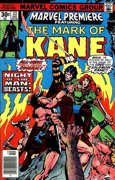
Cover to Marvel Premiere #33 (Dec., 1976). Art by Howard Chaykin and Klaus Janson.
That said, the very next such story to appear would be another REH adaptation; and what was more, it would be appearing in two issues of a color comic, rather than in Savage Sword of Conan. But for more about Roy Thomas and Howard Chaykin’s adaptation of “Red Shadows”, you’ll have to return to this space in September. I hope to see you then.
Neal Adams, as most of his peers and fans know, was notorious for blowing deadlines, often (conveniently) losing a portfolio while sleeping in the back seat of a taxi or on the subway, and forgetting to bring it with him.
He had become unreliable.
While he complained about the Tribe “not understanding” his layouts, they did a fine job under the circumstances. Ironically, by the 1980s Neal began to use a lot of “ghost artists” from the Philippines whom he trained “to draw like me” in his deadline-troubled Continuity Comics of the 1980s and ’90s. The results never approach the level of quality and dynamism in his comics and illustration work of the 1960s and ’70s (and the scripts never remotely challenged the caliber of Roy Thomas or Denny O’Neil).
But Neal Adams’ comics and magazine work of the 1960s and ’70s is *very* well represented in my personal collection.
Hi, Alan!
AsI think I’ve mentioned in the past, I could never get into Conan, regardless of my appreciation for Thomas’ witty and literate scripting or the caliber of the art. (And consider that in the span of about 18 months, the color Conan title was drawn by Gil Kane, Barry Smith, John Buscema and Neal Adams – talk about murderers’ row! – that caliber was pretty high.)
However, despite general indifference to Conan the character, I was NOT indifferent to the news that Adams was drawing a story for SAVAGE SWORD, so my eyes were peeled for this issue. Like you, I was disappointed that it wasn’t “pure” Adams, and that fact that some characterss clearly had been inked by him was a bit of a tease. (Am I the only one to notice that most of the Nefaratari figures – I do mean FIGURES, hubba hubba – seem to have been inked by Adams?) I thought the art was OK, if not X-MEN/AVENGERS level.
The twists in the story were interesting, especially the double-helix at the end with Conan coming out on top. But it all sorta confirmed that this was not a series or character I needed to follow.
Even if I had known this was the last time Adams and Thomas would work together, I had had my heart broken by enough other comics creator news in 1976, that it really might not have saddened me THAT much.
I did interview Adams over the phone circa 2007/2008. (At the time, I was a volunteer dj at a local college station, and I was also a freelance writer for a couple of publications, so I was doing lots interviews. Plus, I had a reputation as a comic book fan. So it wasn’t a surprise that the Station manager, who for some reason had been approached about conducting an interview with Adams, asked me to do it. Actually, it was funny; Paul asked me, “You ever hear of a comic book artist named Neal Adams?” Ummmm – yeah I had…)
Anyway I asked Neal about working with Thomas and Denny O’Neil, whom I referred to as his most prominent collaborators. I have to say Adams was really gracious about it. He said Thomas was really smart and well-read, and he had a literature background that made his writing interesting. Maybe by that time, any acrimony was in the past? If not, he covered it well.
Thanks for another sterling write-up of a book that didn’t have that much resonance, Alan!
Yes, REH’s Shadows over Zamboula had racist descriptions that I found appalling, like describing cannibals shuffling along like Stepin Fetchit. Roy did fine job skirting the more racial descriptions. This story was most problematic racism of his Conan’s stories.
I served in the Global War on Terrorism (“GWOT”) in East Africa.
The mistreatment (likely “genocide”) conducted by the Sudanese Government against the Fur and the Masalit tribes (“Darfur” in Arabic means “Land of the Fur”) in 2004 was something we observed but was probably just outside our mission.
The Fur and Masalit were settled farming cultures; the people who were rooting them out (with some apparent cooperation from Sudan’s government) were Arab pastoralists who wanted the farmers’ land for grazing. (The phrase “plausible deniability” was used by some, well, primarily me.)
Howard’s understanding of the cultures of the area was not only mistaken, in this case, it was diametrically wrong.
Pancakes for breakfast. Nothing wrong with them. But never a favorite of mine either. To me, there’s always a “sameness” that limits their appeal.
That’s essentially how I look at sword and sorcery comics – particularly Conan the Barbarian. Absolutely nothing wrong with them. But nothing compelling enough to bring me back on a monthly basis.
However, going back to my pancake analogy, you can dress them up enough to certainly catch my interest. Mix in blueberries or some enticing syrup and suddenly my taste buds are much more intrigued. Having Neal Adams draw an issue serves as an excellent example of “dressing up” a barbarian comic. His panel arrangements, figures, expressions – go down the list – are all quite dynamic and certainly worth the price of admission.
Which goes to my other point. I would also say that Neal Adams is the rare comic book artist – at least in my mind – whose work has aged remarkably well. Consider legendary talents like Jack Kirby and Steve Ditko. For all their groundbreaking contributions to comics, their work still seemed tied into or a better “fit” for a certain era. But when I look at Neal Adams art on Batman, X-Men or the Avengers, it’s still every bit as stunning to me now as it was then. The only other artist I can immediately think of whose style had that same long-term appeal was George Perez.
It’s a shame his working relationship with Roy Thomas ended in this manner. But to quote Depeche Mode, “People are People.” Fortunately for us, Alan is Alan – meaning we are once again treated to a wonderful review to commence our weekend!
I’ve probably read fewer than 10 Conan comics in my life, and I still like him more than pancakes. I could never handle that at a friend’s house you were expected to eat a stack of those things. I’ve never seen anyone eat 8 pieces of toast, but pancakes mean you’ve entered a breakfast eating competition.
Also.. the art by Adams’ and crew looks great. Nice write up.
Pancakes are why I don’t enjoy going out for breakfast. At the risk of alienating anyone, I don’t like eggs. That greatly limits breakfast options at restaurants. Which means…pancakes with whatever other greasy options are available. Conan has never been that bad. 🙂
I feel you. I dislike eggs and can’t stand even the smell of bacon let alone the taste. Throw in cheese and you get some amusing hocked reactions from people when they learn of my trifecta of verboten breakfast foods.
For the record… I like eggs for breakfast more than I like Conan. I don’t cook bacon anymore or order it frequently because it’s unhealthy, but I order it for breakfast on the rare times I’m in a New York diner… because it’s always pure magic. Aram Baksh is never on the menu though it sounds good!
Somehow I think you guys are maneuvering this into the Monty Python spam and eggs skit.
In a discourse including pancakes, Conan, eggs and now spam I will admit… there’s not much Conan in it.
Obviously, you’ve never sampled Aunt May’s famous wheatcakes.
They’re probably delicious, but Aunt May serves enough wheatcakes in Spidey’s origin to feed 5 Peter Parkers. By contrast…. Aram Baksh is also big, but he’s feeding a lot of cannibals.
The appearance of the finished art looks quite variable in places. Mostly fine with the Adams backbone but the page just before and then with the strangulation scene looks overall cruder. The figures , specially of Baal-pteor are stiff and quite un-Adams like. Maybe they were pages he didnt get to lay out in much detail, if at all. I know it was a mixed effort, but for me, they just stand out compared with much of the earlier pages as if the latter part of the story needed more drastic reconstruction work.
On topless female characters, I am reminded of the introduction of Flower by Kirby in Kamandi, (1973) in a mainstream title , with strategically placed long hair . Seems like such implied toplessness got past any Code restrictions by then whatever the guildlines might have been.
That splash page looks like Zabibi’s head came OFF with the gent strangling her from behind. 😅 Look at where her neck should be in relation to the rest of her body. And that may be something Neal didn’t correct, but should have. Not even sure the Tribe can be blamed for that one.
Correction: not strangling her, but with his hand clasped over her mouth.
The back-and-forth between Thomas and Adams over whose fault it was that Adams’s layout got sent to the Philippines to be inked is depressing. Given the deadline and commercial pressures that comic creators labor under, it’s a miracle that anything worthwhile ever emerges from the sausage grinder, and yet so often miracles do happen. I agree with Alan that Neal Adams art inked by many different hands is better than no Neal Adams art at all.
It might have been better (mostly, faster) to have given the layouts to Giordano or Palmer in the NYC area to finish.
I can’t speak to “rate arbitrage.”
I suspect that Thomas would have considered Giordano (Adams’ business partner) to be too close to the situation to be comfortable asking him. And I’m pretty sure I read somewhere that Tom Palmer had sworn off working with Adams after their Avengers run, at least for a while, due to what he went through to make up for Adams’ chronic lateness.
It’s a shame that in the wild wild west of the Marvel Bullpen circa 1976, Thomas couldn’t have found a way to stretch the schedule and give Adams time to be Adams and turn in a completed artwork, but to be fair, Adams was slow to begin with, and on top of all his other work, most of which paid much better, he was his own worst enemy when it came to making a deadline. From listening to their various recollections, I don’t get the impression that Neal and Roy spoke much, once the plotting was done. Their various recollections never include, “So I spoke to Neal…” or “I got on the phone with Roy.” That may simply not be the way they tell their stories and thus, not mean anything, but as busy as both Neal and Roy were, I imagine there was little time for long conversations. Hard to believe that Roy didn’t ring Neal up to tell him he was sending what he had to The Tribe to be inked, though.
Speaking of The Tribe, their inking style appears to be much heavier than what Adams is used to, but I don’t think they misread the assignment too much. The scene between Conan and Baal Ptor and the drawing of the statue of Hannuman seem to be the moments when The Tribe most got away from Adams’ intent, but for the most part, I think they stay true to his pencils. Adams says his pencils were almost tight enough to ink from, and it doesn’t look like he was far off.
It’s no secret that REH was racist. In the 1930’s most people were. He might not have been as bad as Lovecraft, as least not in the way it was reflected in his work, but good on Roy for cleaning up his most egregious descriptions for a 70’s audience. Howard’s racism was much more evident in his Solomon Kane stories, especially the ones where Kane traveled to Africa. I read those a few years ago and they are truly offensive.
I also met Adams once. A couple of years before he died, he was a regular guest of Pensacon and after a year or two of working myself up to it, I finally, in what turned out to be his final appearance, got up the nerve to get a picture with him and ask some questions. Though we spoke mostly about Denny O’Neill and Batman, he was quite kind when he spoke of Roy. I suppose time heals all wounds. Thanks. Alan!
It might be heresy to say… and I don’t see it reflected in the work above, but Adams’ ink line could at times be too delicate for the comic book page… at least how they were printed in the 60’s and 70’s. That the Tribe inked him heavier than he would himself stands to reason.
Neal Adams inked himself in his 1960s DC output (war comics stories, Deadman and Spectre issues, and Brave & the Bold, several World’s Finest issues, not to mention his humor stuff on Bob Hope and Jerry Lewis), and it all looked great. Strong use of solid blacks, great variety of line weights/textures with brushwork as well as pen and ink, and some screen tones here and there. DC’s printing was superb in those days, and didn’t falter until late 1974/early 1975 (Marvel in 1974). Neal’s inks looked great on his Clark Kent/Superbaby backup story circa 1972 as well, and he usually inked his own covers.
It wasn’t until the 1980s when he turned to microns and the inks became a scratchy mess for a number of decades.
There is an artists edition of his DC work that came out a few years ago, shot from original art, and it is a tour-de-force. I am happy to own it and the DC Wrightson artefact edition. Fine work when they were in top form (though some of Berni’s early, less polished work from 1968-69 is in there, too, but he artistically grew by leaps and bounds).
Appreciated. To clarify Adams’ inking his own work doesn’t kill it for me… it’s organic with a lot of contrast, but I think Giordano and Palmer are technically better inkers on Neal’s pencils. I wouldn’t say their hands are “heavier” but their brush line doesn’t tend to fall away at its thinnest stroke. Neal’s inking is generally more delicate and can fall off when he employs his thinnest lines. They are all somewhat consistent in approach in that none of them employ a contouring “dead line” to contain a figure ala Gil Kane or Steve Ditko. As I said before… “heresy” since Adams’ own approach is the pure artistic vision… just don’t think he was always best served by the limitations of comic printing back in the day. I agree that the shots from the artist edition are all gems though.
The Neal Adams DC Artist’s Edition features the complete issue of Green Lantern where Berni Wrightson inked Adams, and, to me, that one-off pairing (they did work together on a Western story also featured in the same book) just might be the pinnacle of Big Two comic art, especially in that presentation shot from the original art pages. Wrightson’s brushwork blends perfectly with Adams’s pencils to create something truly special.
I think I’ve touched on your other point before – that in the late ‘60s and early ‘70s, DC’s and Marvel’s printing quality on newsprint could be surprisingly good, but I agree with you that around 1974/75, the printing quality of four-color comics fell off a cliff, due to metal plates being replaced by plastic plates, and to the quality of the inks used being watered down, if an interview I read with Paul Levitz can be believed, but the fall-off was obvious. The other day I read a 1976 issue of The Flash whose printing quality was truly abysmal, to some degree the DC Implosion may have happened because the stories were almost impossible to read due to the crappy printing. DC switching to Baxter paper and better coloring and printing in 1983/84 was a much-needed improvement in printing technology.
I thought that El Diablo story you mention was perhaps the best inking of Adams, I ever saw.
I liked Palmer, Giordano and (the usually forgotten) Anderson’s work with Adams, but Wrightson added something special.
Damn. I have never read either the original prose “Shadows in Zamboula” by REH or the adaptation by Thomas, Adams & the Tribe, but that’s a really dark, violent story, with Conan at his most brutal & devious. I mean, I’ve always argued that Conan is, at best, an anti-hero, one who is very seldom motivated by altruism, and that comic fans who expect him to act like a typical superhero are going to inevitably be disappointed, but this tale really demonstrates just how morally gray the character could actually be.
I’m glad to see that Thomas excised some of the more overtly racist dialogue from this adaptation. I tend to chalk up REH as an unfortunate product of his time. Sadly, there were a great many people who felt the exact same way that he did back in the 1930s. But I am much more apt to judge those who in the present day still hold such bigoted attitudes, because in 2026 they really ought to know better.
Regarding the differing accounts between Thomas and Adams over what went wrong with this adaptation, well, just like Englehart vs Conway on Avengers #150, we will never know the full, true story. From the Adams and Thomas quotes Alan has posted in his retrospective, it does sound like an unfortunate case of miscommunication between the two men.
So, how does the actual, published adaptation of “Shadows in Zamboula” work, art wise? It looks pretty good, with (as Alan observes) some very solid layouts & storytelling by Adams. I imagine it would have been an amazing story if Adams had drawn the full artwork. But I guess DeZuniga & his studio did a solid enough job with the inks / finishes. I think it’s somewhat dark & muddy in some places, but for the most part it works well enough.
As for the Solomon Kane back-up tale, I know I must have read this a number of years ago when I picked up the Dark Horse trade paperback collecting all of the black & white Marvel stories starring the character, but for the life of me I couldn’t remember a thing about it as I read Alan’s blog post! I should try to find that collection and give it a re-read. Anyway, it seems like a nice little horror adventure tale, with some decent, promising early work by the soon-to-be-great Mike Zeck.
Just to add, that shadowy heavily inked last panel where he is lying on the bed and something “supernatural” is coming via the locked door is a standout panel that really utilizes the black and white. Definitely Adams i would say there.
Weird. I’ve been intermittently rereading REH’s Conan stories and I just got to this one last week. In the forty or so years since I’d last read it, I’d forgotten just how repugnant Howard’s racism could get, and, as Ben Herman observes above, how morally ambiguous Conan often was in the original tales. Thomas somewhat toned down this aspect of his character, especially in the Code-approved colour comics, as he wisely did with Howard’s racism in this adaptation.
Reading today’s review reminded me that the African cannibalism motif persisted, astonishingly, in British comics into the 1970s. Even more astonishing, it was usually played for laughs, with the cliched image of the white explorer in the cookpot surrounded by offensively caricatured Black Africans forming either the setup or the payoff to the gag.
Back to the work at hand – Whoever was right or wrong, and we’ll probably never know, it’s a real pity that the stars didn’t align to allow Adams to finish this story. There’s just enough of his finished art in these pages to suggest that the whole could have been something really special. As it is, Dezuniga and his colleagues didn’t overpower Adams’ pencils as completely as they later would Walt Simonson’s on his first stint on Thor, so there’s that.
Another really enjoyable and interesting review, Alan – thank you very much as always!
That really nice illustration by Brunner / Leialoha looks to have more than a touch of Jim Starlin about it. The position of Conan’s right leg against the horse, the delineation of musculature (check the rib cage!), and the tell-tale parallel lines shading the right knee are all Starlin trademarks from his early work. I can’t locate an obvious source to suggest plagiarism, but I’d bet Starlin was somehow involved (willingly or not).
It should be noted that this adaption didn’t only soften some of the more overt racist sentiments. In the original REH text, when Conan first encounters Zabibi / Nafertari being abducted in the street, she’s described as being ‘as naked as the day she was born’, not just topless (and I don’t think it’s mentioned anywhere that she ever stops to put anything on). You have to wonder how Adams (or Kirby with Kamandi’s Flower), might have dealt with that. The contrary side of me would have enjoyed seeing a female character with a very specific ponytail and a state of undress, just to see how any artist could have dealt with it.
Regarding the difference of opinion between Thomas and Adams, I’m getting more than a bit tired of people (who we rely on for the behind-the-scenes history and truth behind the comics) all collectively painting themselves in the best possible light and blaming the other guy. I used to work as a QC agent and process ‘expert’ for a major international bank, and we used to train new agents to own their mistakes. If you realise you’ve done something wrong, the best thing in the world you can do is hold your hands up and say: ‘excuse me, I think I’ve f***ed up’. All of the creators we discuss here, favourites or otherwise, all seem incapable of just admitting that they ever got anything wrong. Like John H says above, it’s depressing.
Anyways, another hugely enjoyable and informative review. Thanks, Alan!
I know everyone knows this already. Still the absurdity of showing all sorts of knives in the back,, strangulations, beheadings and what have you and….you CAN’T show even partial woman’s nipple! In a black and white drawing even! Ridiculous. Anyway, another great post. I love all the “inside baseball” of what was going on between Thomas and Adams. Creative people sort of live in their own minds. So sometimes finding out how to be good collaborators doesn’t come easily to them.
Savage Sword nos. 3 and 5 have fleeting nudity, and it became more regularly seen in issues from 1978-79 (when Heavy Metal and Warren did the same). It may have simply been Neal’s or Roy’s choice to keep the female character “covered” which, in some ways, is more titillating than all out nudity (Maxim magazine proved that several decades ago when it was outselling Playboy with alluring femmes who *almost* bare it all). A case in point for “less is more.”
Neal Adams’ Conan was my introduction to the character via the ’70s Power Records collection, including a story that really stuck with me as a kid, “The Crawler in the Mists.” So for my money he’s the definitive Conan despite producing so little of the character, whereas I find Buscema’s look for the character to be too heavy and thuggish.
In comics, yes, but Frazetta’s paperback book covers of the mid-’60s seem to have really set the tone for everyone who came after his success with them, including Adams.
Oh definitely, Frazetta set the template–I have a collection of those Ace and Lancer Frazetta (and Vallejo) editions from the 60s/70s/80s. But I hadn’t seen them when I got the Power Records collection so Adams was my first exposure to the character.
I own “Crawler,” too, by the way, and a few others Adams book & record comics. Great stuff!
By the way, if any of you are Tubi members or have the free app, you can watch “Death to the Pee Wee Squad,” written, directed, and starring Neal Adams. “Citizen Kane” it isn’t! Also titled “Nannaz,” and filmed circa 1982, though “released” through Troma (pronounced “trauma?”) In 1988.
One IMDB viewer said it had the same plot as “Home Alone,” but wasn’t as fun (an understatement). Neal stars as a scientist, sporting glasses and a moustache. His children Zeea and Jason are in it, as well as comics pros Jay Scott Pike, Jack Sparling, Gray Morrow, Larry Hama, Denys Cowan, and Gary Groth (The Comics Journal publisher).
I once watched this dubbed in Spanish(!). View at your own peril.
https://tubitv.com/movies/100030224/death-to-the-pee-wee-squad
Hama was also a somewhat successful actor.
Beautiful looking story.
One of the drawbacks of reading Essential Savage Sword of Conan some years back is that the visuals drive home Howard’s racism — the black cannibals here, the actions of the white protagonist in Drums of Tombalku (a bandit and outlaw, he turns on his black comrades because he can’t let them rape a white woman). For that matter Hanuman is, as far as I know, a benign figure in Hindu mythology.
Story still looks great. The Tribe delivered.
To avid the racist undertones (and the overt ones!) they should have not portrayed them as Black at all.
Other than Mad, I was still a few years off from purchasing magazines in the summer of 1976. Anyhow, enjoyed the art even if Adams himself was sickened at the inking. But I’d agree that even if all had gone well between he and Roy on this collaboration, Adams seemed mostly out the door in regard to comics anyhow on anything but special projects he could take his time on or whatever he otherwise had full control over. I don’t recall reading anywhere that he had any sort of major falling out with his primary collaborator over at DC, Denny O’Neill, not that I’d be all that surprised if they did.
As to the source material, given that Howard was raised in Texas in the early 1900s, it’s not particularly surprising that he so casually and routinely dropped racist sentiments into his stories. Alas, too many writers & artists, in pulps and comics, from all over the country were doing that well into the 1950s, and the ghastly yellow coloring of most Oriental characters subsisted throughout much of the 1970s. At least Roy had enough sense to eliminate most of the overtly racist elements of the story. My dad, born in Dallas in 1940 and mostly raised near Paris, TX, grew up in that racist culture but grew out of it after he joined the Navy in 1957 and wound up working with and getting to know black sailors and becoming friends with them, coming to the realization that his prejudices were baseless. And that only happened because President Truman, from Missouri, like Thomas, integrated the armed forces by an Executive Order issued in 1948. A friend of mine, Bud, was born in Hannibal, MO (yes, the hometown of another famed Missourian, Samuel Clemens, aka Mark Twain), in 1933. After serving in the military and marrying a woman he met in Germany, he moved to Florida, winding up in Jacksonville in the early 1960s and taking part in civil rights demonstrations, for which he got a few death threats and was even shot at once, but fortunately was not hurt. He’s nearly 93 now and suffering from mild dementia and memory problems, but I admire him for taking a stand that not only wasn’t very popular in this city at the time but was even dangerous.
Well, Adams started to do some covers that started to appear regularly in the Fall of 1976 at DC, probably to generate publicity for the Superman v. Muhammad Ali special. It was nice to see. He also did some uncredited interior work on the Marshall Rogers Hawkman /Calculator story in Detective and the Buckler/Rubinstein CPY Comet/Tommy Tomorrow story.
Adams had been doing bits of uncredited work, inking some of Cockrum’s art of GS Avengers #2 and redrawing a Robin story that appeared in Detective in 1975 by some South American artist he recommended to Julius Schwartz who did not quite get US superhero comics
He also inked part of a Larry Hama Iron Fist story in Marvel Premiere in te summer of 1974.
He finally left color comics for an extended period in 1982 over his controversy with Claremont over what became God Saves, Man Kills.
Don’t forget the public service announcement one pagers Neal Adams did for DC in 1976, And Justice for All Includes Children. Too—-not to mention the double page Saturday morning cartoon ads he did around the same time, and the one page Hostess fruit pies/twinkies comic ads.
At this point in his career he went where the money was. I cannot blame him. 1967-73 was filled to the brim with loads of great Adams comic covers and stories. Readers were spoiled with how prolific he was. Anything he did during the remainder of the ’70s for comic books, magazines, comics/records, and paperback book covers was a treat that had to be tracked down, as he rarely stayed in one place, and mostly worked in collaboration. Besides Superman vs. Muhammad Ali, the most concentrated appearance of his work was in the Art of Neal Adams vol. 1 and 2, and the Neal Adams Treasury, vol. 1 and 2, which for me are the swan song of his greatest era in comics.
He also did the very well received covers for the Tarzan paperbacks from Ballentine books in 1976.
He was a great commercial artist.
The high point of this story IMO are the nuances in Nafertari and Conan’s characterizations.
Nafertari is no saint, and she is clearly misguiding Conan on purpose. But her situation does not give her very much choice either, and she is clearly attempting to be fair there at the end – mostly, one would assume, because Conan has been more than fair towards her. I suppose she is also well convinced that it is a very bad idea to have Conan as an enemy, but there is no conflic between those two conclusions.
Conan himself has been manipulated into risking life and limb for reasons not his own. He is Conan, so he survives pretty much unscathed, but the dangers are there. Even so, he turns the tables nicely and even manages to nibble at Nafertari’s vanity while denying her even the ability to complain, in the best scene of the whole tale.
The Solomon Kane story isn’t bad at all, and the implementation is fine, but the plot is a bit predictable and formulaic. Kane always strikes me as something of mostly untapped potential. The character concept is fascinating, but I am not sure he works as a continuing protagonist. He feels a bit too defined by conflicting drives, and I keep hoping that those drives will come to the surface and be resolved by the main plot.
My favorite Kane moment is in one story where he’s hunting down a band of robbers for murdering a young woman. When he has the showdown with the bandit chief, the man asks Kane what the woman was to him — daughter? Sweetheart. Kane replies she’s just an innocent who didn’t deserve death. Bandit: “THAT’S it? Seriously?” (not verbatim, obviously).
Yep – Red Shadows (“Men shall die for this.”) Great stuff!
Adams always did a great Conan. and Conan #37 is one of my favourite comics ever, and although this one is excellent in many respects, it does not hit quite the same sublime notes. When I fist saw the story decades ago, the frequent change in art style ruined the rhythm for me. Re-reading it today, it holds up well, because the story and scripting are solid, and now I don’t mind so much the Tribe pages. DeZuniga often did rush jobs that watered down his artistry, but there are some non Adams pages that are quite passable.
Technically I wonder how the story was produced. Adams’ layouts were normally thumbnails which Adams then light-boxed to full size. The story was fully lettered, which Marvel style normally happens after the penciling and before the inking stage…but some of the art is so much DeZuniga (eg the splash page with Zabibi and Totrasmek) that there could have only been very basic pacing layouts ( the type Kirby did when plotting the Hulk, DD, the X-Men and Shield). Yet Adams had inked approximately one third of the story. So Adams could not have done full pencils from his thumbnails, producing just enough outline for Roy to script, then picking and choosing what to ink from scant layouts ( so Kubert style, in essence drawing with the paint brush) once the scripted and lettered pages were sent back. At the beginning there may have been little correspondence between Roy and Neal, with Roy just sending a copy of the REH story to Neal and asking for 39 pages, leaving the pacing and sequencing to the artist. There may have been more interaction towards the end, otherwise how else could Roy get hold of the pages to send off to DeZuniga?
According to Mark Evanier, Adams was not a slow artist, but an one in a flood of demand. We should count ourselves lucky that he found as much time to devote to comics work as he did. I don’t understand why, however, with the deadline crunch looming, Roy did not decide to create 3 or 4 installments of the story to appear over more than one issue, and have Neal focus on finishing each installment/ chapter in sequence, instead of inking all over the place.
With so much nostalgia of the bronze age this century I think it a miss that no one this century went back to Neal and ask him to properly finish the tale. That would have been a real event!
The Solomon Kane tale has an underground feeling, with the rudimentary but still nice Zeck art. I wonder what happened to him??
ps I thought it was Al Weiss that left and lost his art in a taxi, not Neal!
Neal did it numerous times, or claimed to have. He “lost” the pencils for his final House of Mystery story foe no. 236, and had Paul Kirchner pencil it instead, which Neal quickly inked.
I remember that one. Found the credits really strange as the inks were not at all in the Adams style.